'Sorcerer's Stone'
New interviews with Scholastic 'Harry Potter' staff
October 19, 2008 at 12:59 AM ET
Jeremy
MuggleNet
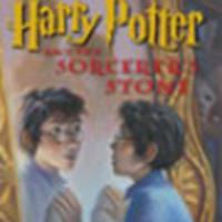
Harry Potter, Scholastic
Scholastic has updated![]() its official Harry Potter website with a brand new feature, "Quick Quotes Quill," which features serveral extensive Q&A's with key members of Scholastic's Harry Potter team.
its official Harry Potter website with a brand new feature, "Quick Quotes Quill," which features serveral extensive Q&A's with key members of Scholastic's Harry Potter team.
One of those interviewed was David Saylor, creative director of the Harry Potter series.
Did you get to read "Harry Potter and the Deathly Hallows" before it came out? Was it hard not being able to talk about Harry Potter secrets with friends and family?
I was one of the few people that was allowed to read the book before it came out, because I was working closely with Mary GrandPré and Arthur Levine on concepts for the cover and chapter opening illustrations, so I had to read the book. It was hard not being able to talk about it, but I was really glad I could share thoughts with Arthur and Mary. It was like a little club. One thing I did learn from my years of working on Harry is that I'm great at keeping secrets!
Each book has a different dominant color. How did you decide which color would be good for each book
For most of the books I had a color scheme in mind, based on something that came through in the story. For example, on Harry Potter and the Order of the Phoenix and Harry Potter and the Half-Blood Prince, there were specific scenes in the book that dictated the color palette that Mary and I wanted to use. Because J. K. Rowling's descriptions are so clear and easily imagined, it wasn't hard to come up with a color scheme. And from the beginning, the palette of the books was based on the “jewel tones” of Mary's artwork: ruby reds, deep amethyst purple, dark sapphires and emeralds.
To read the full interview with Mr. Saylor, click here![]() . And to see all the interviews, click here
. And to see all the interviews, click here![]() .
.